This page lists all the built-in charts you can put in an HTML report.
It is possible to create your own charts without forking the codebase, although the process isn’t obvious or documented. If you really want to do that then reach out and we can talk.
- Text you can set on any chart
aging_work_bar_chartaging_work_in_progress_chartaging_work_tablecycletime_histogramcycletime_scatterplotcumulative_flow_diagramdaily_viewdaily_wip_by_age_chartdaily_wip_by_blocked_stalled_chartdaily_wip_by_parent_chartdaily_wip_chartdependency_chartestimate_accuracy_chartexpedited_chartpull_request_cycle_time_histogrampull_request_cycle_time_scatterplotsprint_burndownthroughput_chartwip_by_column_chartthroughput_by_completed_resolution_chart
Text you can set on any chart
Every chart accepts three pieces of text. Each one has a sensible default, so you only set the ones you want to change.
| Setting | What it is |
|---|---|
header_text |
The heading above the chart |
description_text |
The explanation shown under the heading |
no_data_text |
What the chart shows when it has nothing to show |
cycletime_scatterplot do
  header_text 'How long our work takes'
  description_text <<-TEXT
    <div class="p">Each dot is one completed item.</div>
  TEXT
  no_data_text '<%= render_header %><div>Nothing finished in this period.</div>'
end
Setting a chart to disappear
Set no_data_text to an empty string and the chart contributes nothing at all to the report, not
even its heading, when it has no data.
estimate_accuracy_chart do
  no_data_text ''
end
This is useful for a chart that does not apply to every board. A sprint chart on a kanban board has
nothing to say, and an empty box saying so is just noise, so sprint_burndown already behaves this
way by default. So does estimate_accuracy_chart when nothing carries an estimate.
All three are templates
Each of the three is processed as ERB when the report is generated, so you can calculate parts of the text rather than hardcoding them.
aging_work_in_progress_chart do
  header_text 'Aging Work in Progress on board: <%= current_board.name %>'
end
From inside the text you can call the chart’s own methods, such as current_board above. You cannot
reach local variables belonging to the chart’s code; if you try, you will get an error naming the
variable when the report is generated.
Two things worth knowing:
no_data_textnormally starts with<%= render_header %>so the chart still shows its heading. Leave that out and the message appears on its own.- If you use the stitcher,
grab_by_titlematches the heading as the reader sees it, so a templatedheader_textshould be referred to by its finished text rather than by the template.
aging_work_bar_chart
This chart shows all active (started but not completed) work, ordered from oldest at the top to newest at the bottom.
There are potentially three bars for each issue, although a bar may be missing if the issue has no information relevant to that. Hovering over any of the bars will provide more details.
- The top bar tells you what status the issue is in at any time. The colour indicates the status category, which will be one of To Do, In Progress, or Done
- The middle bar indicates blocked or stalled.
- The bottom bar indicated expedited.
The percentile line
A vertical line marks how long your completed work actually took, drawn that many days back from today. Anything whose bars extend past the line has now been in progress longer than that percentage of everything you finished, which makes it worth a conversation.
By default the line sits at the 85th percentile. Use percentiles to change it, or to ask for more than one.
aging_work_bar_chart do
  percentiles [50, 85]
end
Several lines share the same colour, since their position is what tells them apart. Hover any of them to see which percentile it represents. Pass an empty list to draw none at all. Percentiles must be whole numbers between 0 and 100. See why 85% is the default for the reasoning behind that number.
aging_work_in_progress_chart
For items that have started but not finished, what column are they currently in and how old are they?
aging_work_in_progress_chart
This chart supports the same grouping rules as Throughput Chart. See that chart for an example..
Rules options
| Rule | Description |
|---|---|
| label | The name used for the group |
| color | The color used for the group. If no color is specified then it will be randomly chosen. |
| ignore | Discard this item from the dataset |
aging_work_table
For items that are started but not finished, show a whole variety of information in a tabular format. This includes additional information not found in other charts such as the parent hierarchy, what fix_version this issue is in (if any), what sprints it’s in (if any), due dates, etc.
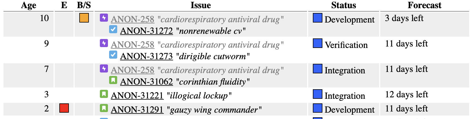
The Forecast column
The Forecast column predicts how much longer an item has to go, based on how long work has historically taken to move through each remaining column on this board. By default it forecasts from the 85th percentile of that historical movement. Use percentile to change it.
aging_work_table do
  percentile 90
end
Note this is singular, unlike the percentiles setting on the charts. A forecast has to resolve to a single number of days, because that figure is also what decides whether an item with a due date is flagged as at risk, so there is nothing sensible for a list of values to mean here. A higher percentile gives a more conservative forecast. Percentiles must be whole numbers between 0 and 100. See why 85% is the default.
Some items cannot be forecast at all, usually because they have already been in their current column longer than the historical figure would predict. Those show a note explaining why, naming the percentile used.
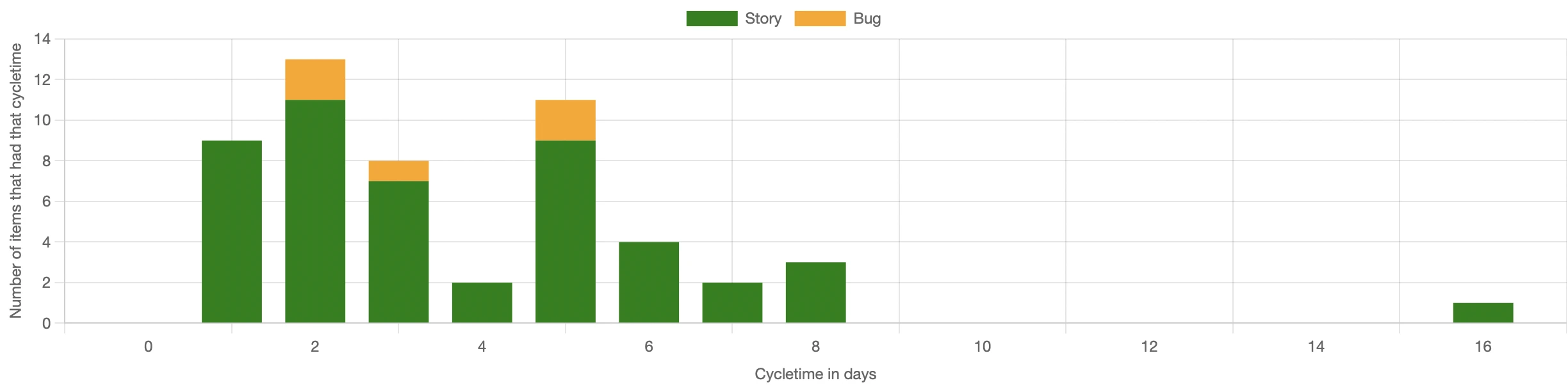
cycletime_histogram
Plots the distribution of cycle times. How many times did something complete in three days?
By looking at the histogram, we can see groupings of different types of work and we can also tell how predictable the work is by how much the cycle times cluster together.
cycletime_histogram
This chart supports the same grouping rules as Throughput Chart. See that chart for an example..
Rules options
| Rule | Description |
|---|---|
| label | The name used for the group |
| color | The color used for the group. If no color is specified then it will be randomly chosen. |
| ignore | Discard this item from the dataset |
Choosing which percentiles the statistics show
Below the chart is a statistics table with a column for each percentile, and a short note explaining what each one is useful for. By default you get the 50th, 85th and 98th: the median, the number most people use for a service level expectation, and a sense of the worst case. Use percentiles to ask for something else.
cycletime_histogram do
  percentiles [50, 90]
end
The explanations follow whatever you configure, so asking for the 90th tells you what the 90th is good for rather than describing a column that isn’t there. Pass an empty list to drop the percentile columns entirely. Percentiles must be whole numbers between 0 and 100, and anything else is rejected when the config is read rather than quietly producing a wrong table. See why 85% is the default for the reasoning behind that particular number.
cycletime_scatterplot
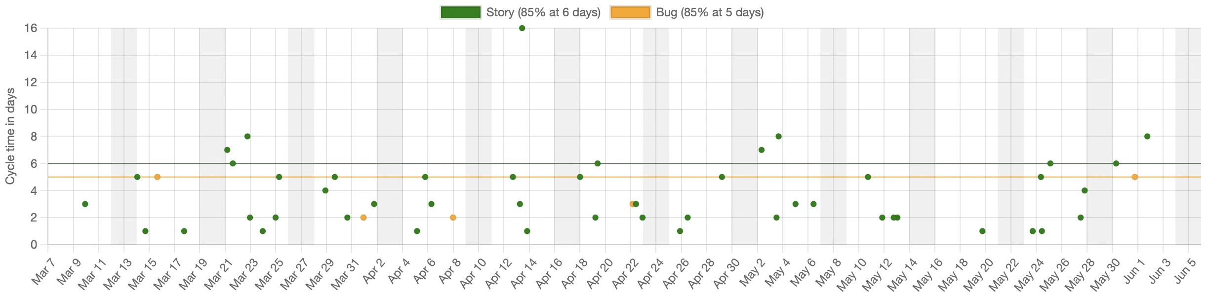
Plots the cycle time (y axis) against the date that the work completed (x axis).
cycletime_scatterplot
You can customize this report with grouping_rules as shown below.
| Rule | Description |
|---|---|
| label | The name used for the group |
| color | The color used for the group. If a colour isn’t set then it will be randomly chosen. |
| ignore | Discard this item from the dataset |
| percentiles | Which percentile lines to draw for this group, overriding the chart default. See percentile lines. |
Example
cycletime_scatterplot do
  grouping_rules do |issue, rules|
    # Put all data into groups by type. Use the name of the
    # type as the label for the group
    rules.label = issue.type
    if issue.type == 'Story'
      # Set the color of stories to be green
      rules.color = 'green'
    else issue.type == 'Spike'
      # Ignore spikes
      rules.ignore
    else
      rules.color = 'yellow'
    end
  end
end
Choosing which percentile lines to draw with percentiles
The chart draws horizontal reference lines at chosen percentiles of the data. If a line sits at 12 days then that percentage of the work completed in 12 days or less. One line is drawn across the whole data set, in its own colour, and one is drawn for each group in that group’s colour.
By default the chart draws the 85th percentile, which is a reasonable proxy for “most”. Use percentiles to ask for something else.
cycletime_scatterplot do
  percentiles [50, 85, 98]
end
The 50th tells you the typical case, the 85th is the usual choice for setting a service level expectation, and the 98th shows you the worst case you should plan for. Asking for more lines makes the chart busier, and how busy is too busy is your call.
Pass an empty list to switch the lines off completely.
cycletime_scatterplot do
  percentiles []
end
Hover over any line to see which line it is and what its value is, for example Story 85% at 12 days. The line drawn across the whole data set names itself All items, since it has no legend entry of its own. Values also appear in the legend entry for each group, so Story (85% at 12 days) tells you the 85th percentile for stories is 12 days without having to hover at all.
Different percentiles for different groups
The chart level setting does double duty: it defines the lines drawn across the whole data set, and it supplies the default for every group. A group can override that default by setting percentiles in its grouping_rules block.
cycletime_scatterplot do
  percentiles [85]

  grouping_rules do |issue, rules|
    rules.label = issue.type

    # Bugs get a second line so we can see the typical case as well
    rules.percentiles = [50, 85] if issue.type == 'Bug'

    # Spikes are too variable for a percentile to mean anything
    rules.percentiles = [] if issue.type == 'Spike'
  end
end
A group that never sets percentiles inherits the chart default. Setting it to an empty list is different from not setting it at all: the empty list means this group shows no lines, while leaving it alone means “use whatever the chart says”.
Percentiles must be whole numbers between 0 and 100. Anything else is rejected when the config is read, rather than quietly producing a misleading chart.
The same option is available on
pull_request_cycle_time_scatterplot.
Showing trend lines with show_trend_lines
Off by default. When switched on, the chart adds a dashed line for each group, in that group’s colour, fitted through that group’s dots. The slope tells you whether cycle times have been getting longer or shorter across the period shown.
cycletime_scatterplot do
  show_trend_lines
end
It is a straight-line fit, so it describes the window you are looking at rather than predicting beyond it, it cannot show a trend that changed direction partway through, and a handful of unusually long items will tilt it noticeably. A group needs at least three items before a line is drawn at all, since two will always fit a straight line perfectly and so tell you nothing. Even then, nothing checks how well the line fits, so a scattered cloud with no real trend in it still gets a confident looking line through it. The chart says as much underneath itself when the lines are turned on.
The same option is available on pull_request_cycle_time_scatterplot.
Capping the y axis with cap_y_axis
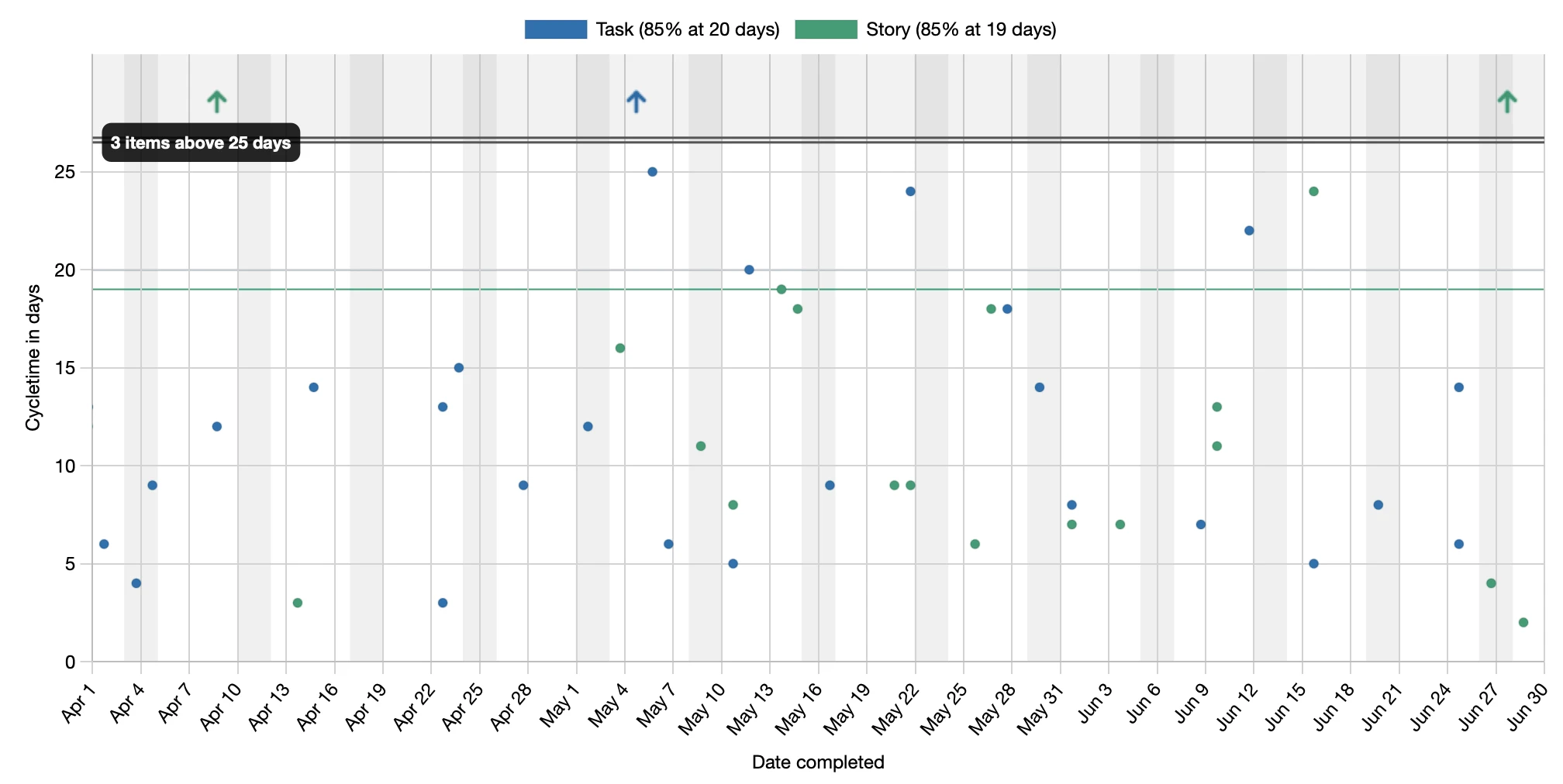
A handful of very long-running items can stretch the y axis so far that the bulk of your work is squashed into a thin band at the bottom and becomes hard to read. Making the chart taller does not help, because the problem is the range, not the height.
cap_y_axis caps the y axis at a percentile of the data so you can zoom in on the cases that matter most. Items above the cap are not discarded. They move into a distinct band above an axis break (drawn as a double line), shown as up arrows in their group colour with a label counting how many there are. Hovering an arrow still shows its real cycle time. Everything below the break expands to fill the readable area.
cycletime_scatterplot do
  cap_y_axis percentile: 90
end
The option is off by default; without it the chart shows every item, auto-scaled as before. Called with no argument, cap_y_axis defaults to the 98th percentile, which keeps all but the genuine long tail on scale. Capping only changes what you see, not the numbers: the percentile lines are always calculated from the full data set.
The same option is available on
pull_request_cycle_time_scatterplot.
cumulative_flow_diagram
A Cumulative Flow Diagram (CFD) shows how work accumulates across board columns over time. Each coloured band represents a workflow stage. A widening band means work is piling up in that stage - a bottleneck. Parallel band edges indicate smooth flow.
Dashed lines and hatched regions indicate periods where an item moved backwards through the workflow.
cumulative_flow_diagram
The chart overlays two trend lines showing the arrival rate (how fast work enters the system) and the departure rate (how fast it leaves). Moving the mouse over the chart shows a Little’s Law triangle at that point in time, labelled with WIP (items in progress), cycle time (average days to complete), and throughput (items per day). A checkbox above the chart toggles between the triangle and the normal data tooltips.
You can customise the chart using column_rules and colour options:
cumulative_flow_diagram do
  column_rules do |column, rule|
    rule.color = '#4a90d9' if column.name == 'In Progress'
    rule.label = 'WIP'    if column.name == 'In Progress'
    rule.label_hint = 'Items actively being worked on' if column.name == 'In Progress'
    rule.ignore         if column.name == 'Review'
  end
  arrival_rate_line_color   'rgba(255,100,50,0.9)'
  departure_rate_line_color '#80cbc4'
  triangle_color            '#ffff00'
end
column_rules
| Rule | Description |
|---|---|
| color | The colour used for the column band. Accepts any CSS colour string. If not set, a colour is chosen automatically. Note: only #rrggbb hex values will have the band fill automatically lightened; other formats are used as-is for both the border and fill. |
| label | Overrides the column name shown in the chart legend. |
| label_hint | Tooltip text shown when hovering over the legend item for this column. |
| ignore | Exclude this column from the chart entirely. |
Colour options
| Option | Default | Description |
|---|---|---|
arrival_rate_line_color |
rgba(255,138,101,0.85) |
Colour of the arrival rate trend line and its label. Pass nil to hide the line entirely. |
departure_rate_line_color |
rgba(128,203,196,0.85) |
Colour of the departure rate trend line and its label. Pass nil to hide the line entirely. |
triangle_color |
dark/light pair | Colour of the Little’s Law triangle sides. |
To hide one or both trend lines:
cumulative_flow_diagram do
  arrival_rate_line_color   nil  # hide arrival trend line
  departure_rate_line_color nil  # hide departure trend line
end
See also, this article on how to read a cumulative flow diagram
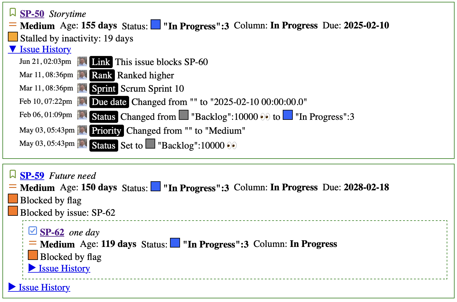
daily_view
This report lists all the aging items in order of importance. We find that many teams aren’t clear on what order they should discuss items in their daily meeting (standup / scrum / etc) so this chart lays them out in the correct order, sorted first by priority and then by age within that priority level. Most important at the top and least at the bottom.
The expectation is that you can use just this view during your daily meeting, without looking at the Jira board itself. We’re still experimenting with exactly what information needs to be presented in order to meet that goal, so this may change over time.
To understand the motivation for this chart, see this article.
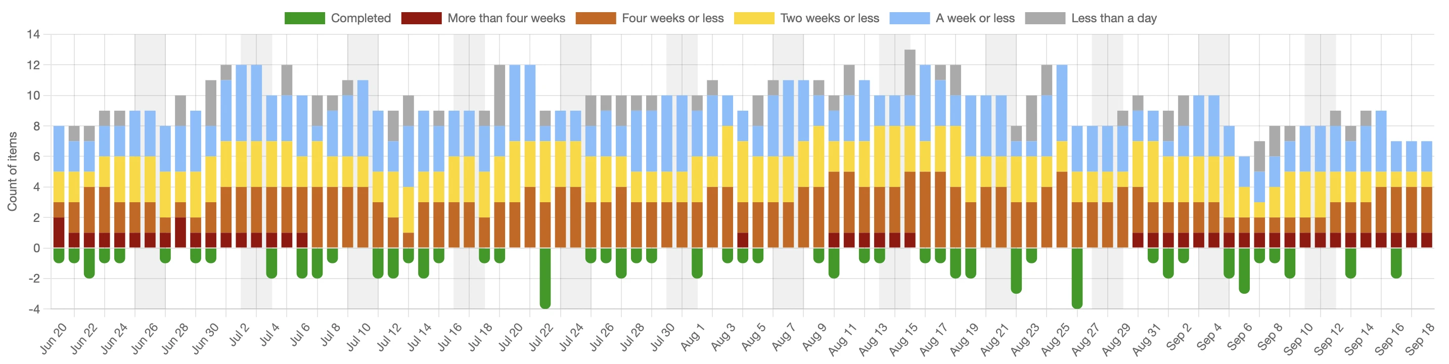
daily_wip_by_age_chart
For each day in the period, how many items were in progress? Items are colour coded based on how long they’ve been in progress.
daily_wip_by_age_chart
For documentation on options for this chart, see daily_wip_chart
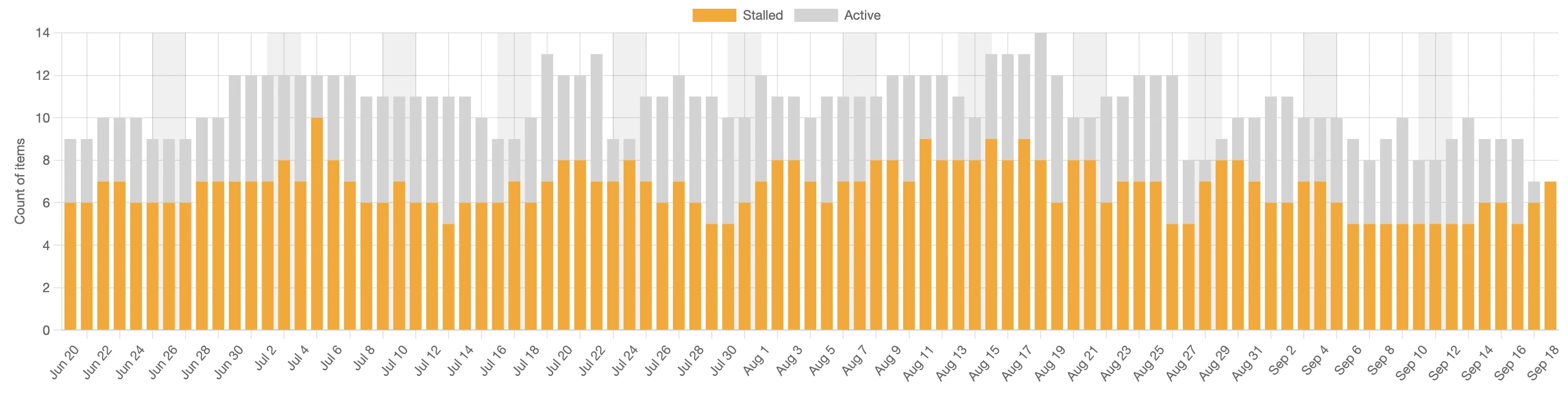
daily_wip_by_blocked_stalled_chart
For each day in the period, how many items are blocked (Flagged in Jira terms) or stalled (no status changes in the last five days)?
daily_wip_by_blocked_stalled_chart
For documentation on options for this chart, see daily_wip_chart
daily_wip_by_parent_chart
Grouping the WIP by the parent ticket. This is useful to see if we’re focused on more strategic goals (small number of epics) or whether our focus is scattered.
daily_wip_by_parent_chart
See this article for more details on what we can learn from this chart.
For documentation on options for this chart, see daily_wip_chart
daily_wip_chart
The daily WIP charts above are just customized versions of the more generic daily_wip_chart. If you want to build your own, you can do that with code like the example below. This example groups the daily WIP by the parent of the ticket in progress.
daily_wip_chart do
  header_text 'Daily WIP by Parent'
  description_text <<-TEXT
    How much work is in progress, grouped by the parent of the issue. This will give us an
    indication of how focused we are on higher level objectives. If there are many parent
    tickets in progress at the same time, either this team has their focus scattered or we
    aren't doing a good job of splitting those parent tickets. Neither of those is desirable.
  TEXT
  grouping_rules do |issue, rules|
    rules.label = issue.parent&.key || 'No parent'
    rules.color = 'white' if rules.label == 'No parent'
  end
end
| Grouping rule | Description |
|---|---|
| label | The text description that will be used for this grouping |
| color | The colour that will be used in the chart for this grouping |
| highlight | True if this item should be highlighted (drawn differently) |
| issue_hint | Extra text that will be visible in the tooltip |
| label_hint | Optional tooltip text shown when hovering over the legend item. |
dependency_chart
Jira gives you the ability to link issues. So you can say that one issue depends on another or one blocks another. This visualizes all of those relationships.
dependency_chart
Note that this requires graphviz to be installed. See the GraphViz website for installation instructions. If GraphViz can’t be found then the report will still be generated but this paticular chart will be skipped.
You can customize this chart with two different kinds of rules. One to describe the actual issues themselves and the other to describe the links between issues.
issue_rules
To customize the individual issues.
| Rule | Description |
|---|---|
| color | The color used for the group |
| ignore | Discard this item from the dataset |
Example
dependency_chart do
  # Set custom colours based on the type of the object.
  # Note that this sample just uses the same colour scheme
  # that you get by default so you'll probably want to change
  # the colour values if you're using this.
  issue_rules do |issue, rules|
    rules.color = case issue.type
    when 'Story'
      '#90EE90'
    when 'Task'
      '#87CEFA'
    when 'Bug', 'Defect'
      '#ffdab9'
    when 'Epic'
      '#fafad2'
    else
      '#dcdcdc'
    end

    # Ignore sub tasks
    rules.ignore if issue_type == 'Sub-task'
  end
end
link_rules
To customize the links between issues
| Rule | Description |
|---|---|
| line_color | The color used for the group |
| ignore | Discard this item from the dataset |
| merge_bidirectional keep: ‘outward’ | If there are bidirectional links (ie A depends on B and B also depends on A) then only draw one of the two lines |
| use_bidirectional_arrows | If there are bidirectional links then display an arrow at both ends of the line. |
dependency_chart do
  link_rules do |link, rules|
    case link.name
    when 'Cloners'
      # We don't want to see any clone links at all.
      rules.ignore
    when 'Blocks'
      # For blocks, by default Jira will have links going both
      # ways and we want them only going one way. Also make the
      # link red.
      rules.merge_bidirectional keep: 'outward'
      rules.line_color = 'red'
    when 'Sync'
      # For sync, also only show one link but this time put
      # arrows at both ends
      rules.merge_bidirectional keep: 'outward'
      rules.use_bidirectional_arrows
    end
  end
end
estimate_accuracy_chart
Graphs the estimates (y axis) against the actual cycle time of the item. It’s useful to be able to see how much correlation there is between the estimates and the actual time it took. By default, it uses story points for the estimate although that can be configured as seen below.
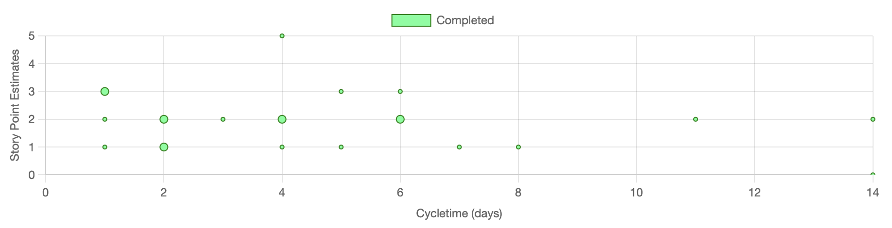
There is never any correlation between the two, which begs the question “why we even do story point estimates if they’re never accurate?” More on that here.
estimate_accuracy_chart
What if you don’t use the story point field and use something custom like TShirt sizes? You can specify that with the yaxis
estimate_accuracy_chart do
  y_axis(sort_order: %w[Small Medium Large], label: "TShirt Sizes") do |issue, started_time|
    issue.raw['fields']['custom_field_34']
  end
end
Note: In this example, custom_field_34 is meant to show what’s possible. It’s almost certainly not going to be called that in your instance. You have to find what field is holding the value you need.
| Parameters | Description |
|---|---|
| sort_order | All the possible options in the order you want to see them displayed. Bottom to top. |
| label | The label you want displayed on the axis |
| block | The code that will extract the value from the issue object. This is custom to your setup |
expedited_chart
This chart shows how many items are expedited and how long they’ve been that way. Configure what it means for an item to be expedited through the expedited_priority_names key in project specific settings
expedited_chart
pull_request_cycle_time_histogram
Plots the distribution of pull request cycle times. How many PRs closed in one day? Two days? This makes it easy to see how predictable PR turnaround is and whether there are outliers worth investigating.
These charts require GitHub pull request data to be downloaded. Add github_repo to your download block and ensure the GitHub CLI (gh) is installed and authenticated. JiraMetrics links PRs to issues by searching for Jira issue keys in the branch name, PR title, and PR description.
pull_request_cycle_time_histogram
The unit used for the x axis defaults to :days but can be changed to :hours, :minutes, or :hours24. :days counts calendar days from midnight to midnight, so a PR opened and closed either side of midnight counts as two days. :hours24 instead counts elapsed 24-hour periods measured from the clock, so that same PR counts as one. For :hours, :minutes, and :hours24, any partial unit rounds up - a PR open for 20 minutes shows as 1 hour, not 0.
pull_request_cycle_time_histogram do
  cycletime_unit :hours
end
You can also customize the grouping with grouping_rules.
pull_request_cycle_time_histogram do
  cycletime_unit :hours
  grouping_rules do |pull_request, rules|
    rules.label = pull_request.repo
    rules.color = 'green'
  end
end
| Grouping rule | Description |
|---|---|
| label | The name used for the group |
| color | The color used for the group. If no color is specified then it will be randomly chosen. |
| ignore | Discard this item from the dataset |
| percentiles | Which percentile lines to draw for this group, overriding the chart default. |
This chart also supports
cap_y_axis and
percentiles, which behave
exactly as they do on the cycle time scatterplot.
pull_request_cycle_time_scatterplot
Plots the cycle time (y axis) against the date the pull request was closed (x axis), where cycle time is measured from when the PR was opened to when it was closed. By default, items are grouped by repository.
These charts require GitHub pull request data to be downloaded. Add github_repo to your download block and ensure the GitHub CLI (gh) is installed and authenticated. JiraMetrics links PRs to issues by searching for Jira issue keys in the branch name, PR title, and PR description.
pull_request_cycle_time_scatterplot
The unit used for the y axis defaults to :days but can be changed to :hours, :minutes, or :hours24. :days counts calendar days from midnight to midnight, so a PR opened and closed either side of midnight counts as two days. :hours24 instead counts elapsed 24-hour periods measured from the clock, so that same PR counts as one. For :hours, :minutes, and :hours24, any partial unit rounds up - a PR open for 20 minutes shows as 1 hour, not 0.
pull_request_cycle_time_scatterplot do
  cycletime_unit :hours
end
You can also customize the grouping with grouping_rules.
pull_request_cycle_time_scatterplot do
  cycletime_unit :hours
  grouping_rules do |pull_request, rules|
    rules.label = pull_request.repo
    rules.color = 'green'
  end
end
| Grouping rule | Description |
|---|---|
| label | The name used for the group |
| color | The color used for the group. If no color is specified then it will be randomly chosen. |
| ignore | Discard this item from the dataset |
| percentiles | Which percentile lines to draw for this group, overriding the chart default. |
This chart also supports
cap_y_axis and
percentiles, which behave
exactly as they do on the cycle time scatterplot.
sprint_burndown
Displays all the sprint burndowns that happened during this period. By default, this renders two charts - the top one is burndown by story points and the bottom one is burndown by story count. If you only want one or the other then you can customize that.
# Generate both burndowns
sprint_burndown

# Generate only the story point burndown
sprint_burndown :points_only

# Generate only the story count burndown
sprint_burndown :counts_only
throughput_chart
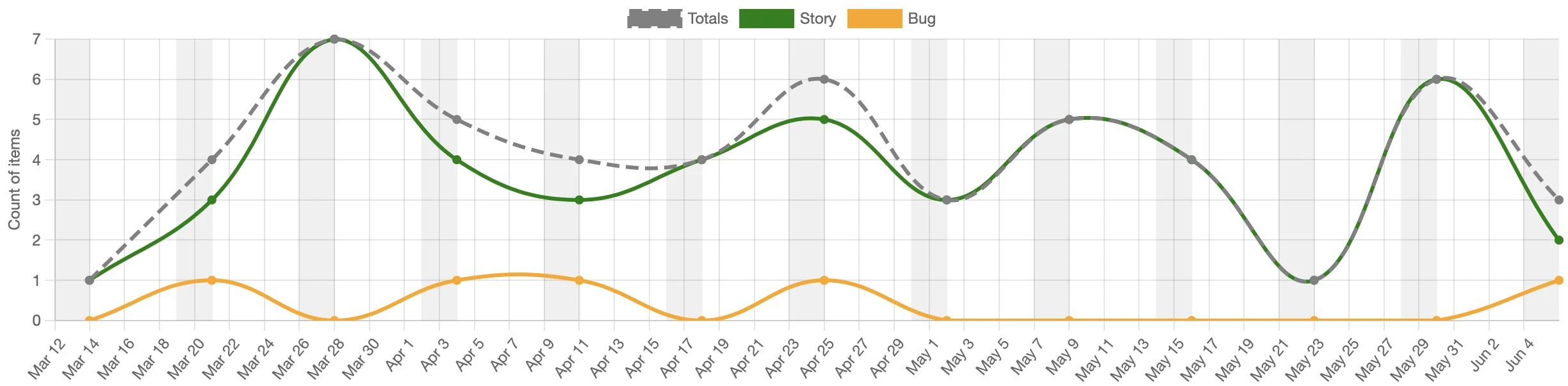
A line chart showing how many items completed each week (Monday to Sunday)
throughput_chart
By default, this splits data across issue types and also shows a totals line.
Rules options
| Rule | Description |
|---|---|
| label | The name used for the group |
| color | The color used for the group. If no color is specified then it will be randomly chosen. |
| label_hint | Optional tooltip text shown when hovering over the legend item. Also used in the data point tooltip as “N items closed with label_hint between …”. |
| ignore | Discard this item from the dataset |
| last_day_of_period | The last day of the time bucket this item belongs to. When set for any issue, the chart switches from fixed weekly periods to the custom periods you define here. Accepts a Date or a String in 'YYYY-MM-DD' format. Items whose last_day_of_period is not set are excluded from the chart. |
The last_day_of_period rule is useful when you want to group throughput by calendar months (which vary in length), sprints, or any other irregular boundaries rather than the default Monday–Sunday weeks. Each unique last_day_of_period value becomes one data point on the x-axis.
Example - grouping by calendar month:
throughput_chart do
  grouping_rules do |issue, rules|
    rules.label = issue.type
    rules.color = color_for(type: issue.type)
    # Assign the issue to the last day of its completion month
    stop_date = issue.started_stopped_dates.last
    rules.last_day_of_period = Date.new(stop_date.year, stop_date.month, -1) if stop_date
  end
end
Example - grouping by issue type (default weekly buckets):
throughput_chart do
  grouping_rules do |issue, rules|
    # Put all data into groups by type. Use the name of the
    # type as the label for the group
    rules.label = issue.type
    if issue.type == 'Story'
      # Set the colour of stories to be green
      rules.color = 'green'
    else issue.type == 'Spike'
      # Ignore spikes
      rules.ignore
    else
      rules.color = 'yellow'
    end
  end
end
wip_by_column_chart
Shows how much time each board column has spent at different WIP (Work in Progress) levels over the reporting period. Each column on the x axis is a board column; each row on the y axis is a WIP level (the number of items in that column at the same time). A horizontal bar at a given intersection shows what percentage of the total time that column spent at that WIP level - a wider bar means more time was spent there.
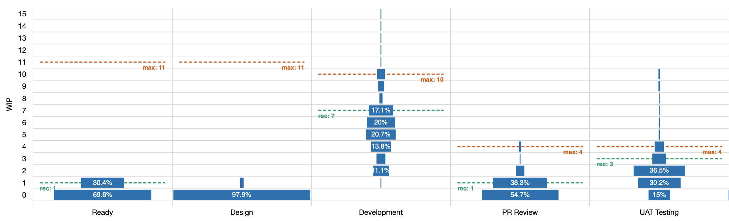
Dashed lines show the minimum and maximum WIP limits configured on the board. Columns with no activity (always at WIP 0) are trimmed from both ends automatically.
wip_by_column_chart
Optionally enable WIP limit recommendations, which analyse the historical data and suggest adjustments:
wip_by_column_chart do
  show_recommendations
end
When show_recommendations is enabled, the chart calculates the 85th-percentile WIP level for each column - the WIP at which 85% of the total column time is accounted for - and draws a recommendation line on the chart. Below the chart, a plain-language summary is shown for each column where an adjustment is warranted:
- “Add a WIP limit to column ‘X’ - suggested maximum: N” - no limit is currently set
- “Lower the WIP limit for ‘X’ from M to N” - the current limit is higher than the data suggests is needed
- “Raise the WIP limit for ‘X’ from M to N” - the team is regularly working above the current limit
- “Almost nothing passes through column ‘X’. Do we still need it?” - 85% of the time this column has zero items
throughput_by_completed_resolution_chart
A variant of throughput_chart that groups completed items by the Jira status and resolution they had when they were done, rather than by issue type. This makes it easy to see how many items completed in each resolution category (e.g. Done/Fixed vs Done/Won’t Fix).
Hovering over a legend item shows the exact status name, status ID, and resolution. Hovering over a data point shows the count of items closed with that status/resolution combination for that week.
throughput_by_completed_resolution_chart
This chart supports the same grouping_rules override as throughput_chart if you want to customise the grouping.